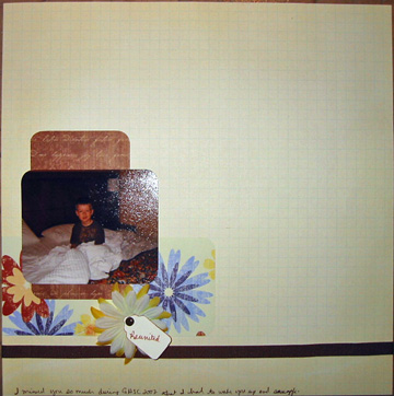
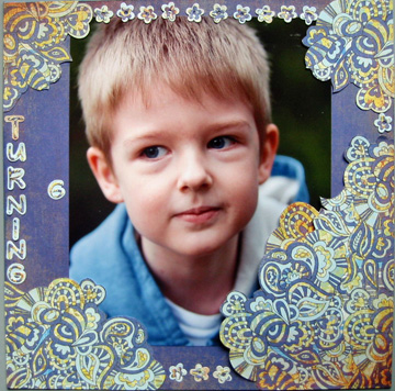
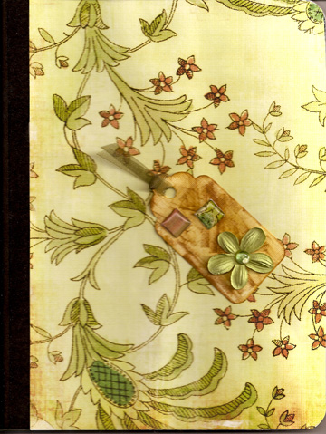
“White space” is a current trend in scrapbooking, but I’ve never been interested in trying it. Until today, that is. There was a challenge at 4 Scrappy Sisters to leave at least 50% white space on a layout. It was really hard, but I managed to do it. I’m not sure how much I like the finished product, but here it is. Reunited:
All critiques are welcome. I’d like to be able to change up styles when I feel like it. Any suggestions for this one?
