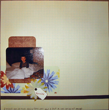
“White space” is a current trend in scrapbooking, but I’ve never been interested in trying it. Until today, that is. There was a challenge at 4 Scrappy Sisters to leave at least 50% white space on a layout. It was really hard, but I managed to do it. I’m not sure how much I like the finished product, but here it is. Reunited:
All critiques are welcome. I’d like to be able to change up styles when I feel like it. Any suggestions for this one?

That’s great Karen! You did a wonderful job on the challenge. Isn’t it hard to leave so much space when you’re not used to it? I know it is for me but wow, you did a rockin’ job! I love it just as it is!
I think you did a great job on the challnege! I really like this! COol using flowers on a boy layout!
I love the flowers all well laid out. Did you try placing the whole piece in the right hand corner? just wondering how it would have looked there…