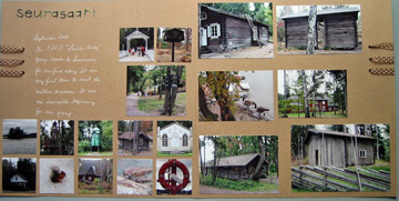
Here’s a 2-pager I just finished. This is for my own contest as well as Tracy’s challenge to do something with ribbon that you’ve never done before. I’ve never done this with ribbon.
The left side.
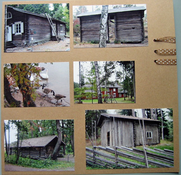
And the right side.
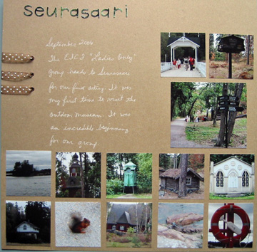
I used a square punch to cut out the smaller pictures. I then used the leftovers from those squares and cut out the title with my Wizard and a set of Sizzlets (Playground font). I might straighten that title up, but I’m not really worried about it. 🙂


Love the photo placement – wow! Lots of ’em! Cool idea cutting title out of the rest of the photos! Love the kraft cs & ribbon work!
Oh wow Karen this is a beautifully done two-pager! I love, love, love the Kraft paper (must get some!) and the way you used the ribbon is FAB!! Love how you used pics for the title (I’ve done that and I’ve always thought it cool!). This really ROCKS!! I love all the pics too, btw!
Love it. You got so many pics in there, and it doesn’t look crowded. The ribbon usage is great too!
wow love all of the pics and the ribbon is awesome and that title is great! really great job karen